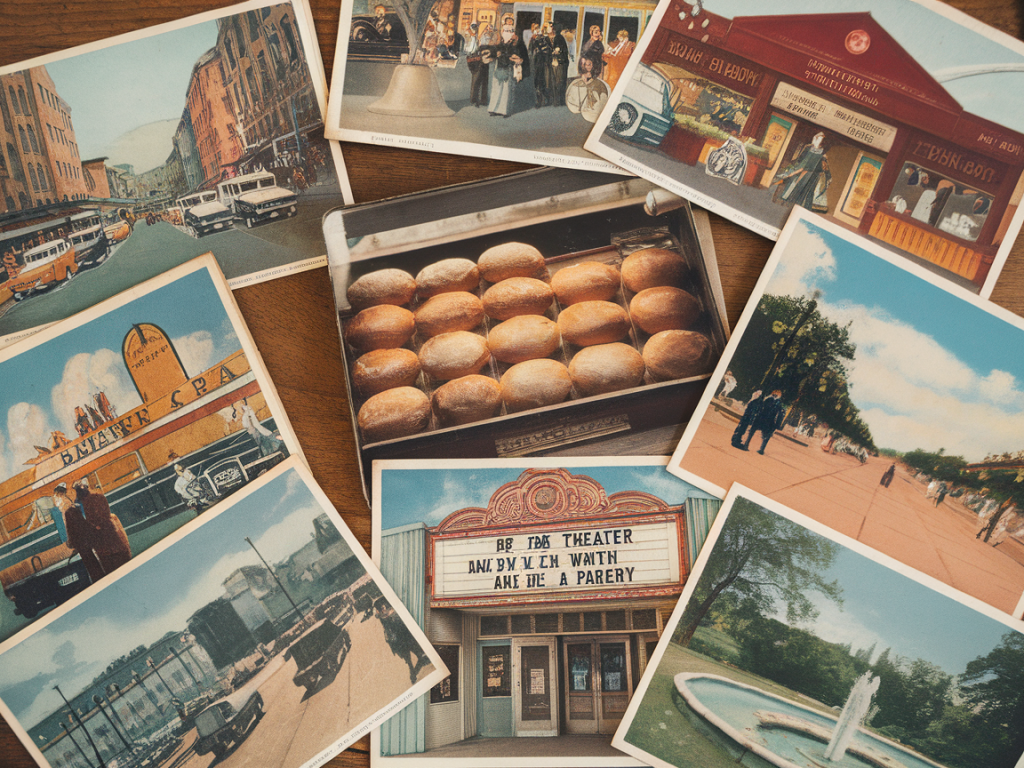
I keep a small stack of postcards in a shoebox on a high shelf — edges softened by years of handling, corners rounded by fingers that once folded them into envelopes or stuck them to fridges. They’re not all that special on paper: cheap stock, a hint of foxing, inks that have bled just a little. But when I pull one out, I’m struck by how much of a vanished everyday world they hold. These cards teach me, quietly and insistently, about the aesthetics we used to live inside and the ways those tastes have evaporated, along with storefronts, street signage, and domestic habits.
What a postcard shows — beyond the picture
A postcard is a small, highly curated view of ordinary life. It’s meant to be shared, mailed, and displayed, which shaped both its imagery and its materiality. When I look at a mid-century card of a coastal town, I’m not just seeing a beach and a pier: I’m seeing photographic styles, printing choices, color palettes, and compositional cliches that were in circulation. Together, these elements form a kind of everyday aesthetic vocabulary.
Here are some of the recurring details I notice and what they tell us:
Why these aesthetics have faded
There are practical reasons the postcard sensibility has receded. Photography and printing technologies changed. Digital images flattened certain textures; affordable digital printing made mass-produced gloss cards look different from older lithographs. Travel culture itself shifted: package holidays, Instagram-ready viewpoints, and branded hospitality created a demand for instantly recognizable, repeatable imagery.
But beyond technology there’s a cultural shift. The mid-20th-century postcard assumed people would collect, display, and re-circulate images of routine life. Domestic interiors were places to arrange small relics. Today, the “display” is more often a phone feed than a mantelpiece. The act of collecting has moved from physical boxes to cloud albums, and that changes what gets saved.
Small examples, big signals
Once, a seaside postcard might include a vendor selling boiled sweets from a striped cart. The cart’s hand-painted sign is not an incidental prop — it’s a marker of small-scale local commerce, of hand-painted craftsmanship. Today that cart is more likely to be a branded kiosk with a printed menu and a barcode. The difference seems trivial until you look at dozens of postcards and notice the scarcity of hand-painted signage in recent decades.
Another small signal: the depiction of public transport. Vintage cards often feature trams or double-decker buses as part of everyday street life, integrated into pedestrian scenes. Contemporary images tend to isolate transport as infrastructure — a photo of a shiny new train station rather than a child waving at a tram conductor. The change parallels how transport moved from being a social stage to a service optimized for efficiency and branding.
What postcard aesthetics can teach designers and communicators
Those tiny choices — color, type, texture, what is framed and what’s left out — are precisely what designers and storytellers can learn from. If you’re working on a travel brochure, a café interior, or a personal website, the postcard archive offers practical inspiration:
A quick comparison
| Vintage postcards | Contemporary images |
|---|---|
| Hand-lettered captions; decorative serifs | Clean sans-serifs; brand-aligned type |
| Glazed or textured card stock | Matte prints, digital screens |
| Human-scale street scenes | Iconic landmarks; staged experiences |
| Color often amplified | Color graded for consistency |
Memory, preservation, and the ethics of nostalgia
It’s tempting to romanticize bygone aesthetics — to prefer faded type and hand-painted signs because they feel more “authentic.” But postcards also tell stories of exclusions. Not every community was pictured. Many cards show sanitized versions of places that erased inconvenient social realities. Holding a postcard is to hold a curated memory, not an exhaustive truth.
That said, preserving aesthetic practices — hand-lettering, local signage, tactile print — is worth considering from a cultural and environmental standpoint. Companies like MOO and local print studios still offer letterpress and textured stocks that echo older techniques. Small publishers and independent letterpress shops are doing meaningful work keeping these practices alive and connecting them to contemporary contexts.
Practical ways to read and use postcards today
Pulling a postcard from the shoebox is always a miniature time-travel. I’m not looking at a perfectly preserved icon; I’m holding a fragment — a fragment that hints at neighborhoods full of signage, cafés with mismatched cups, and a slower, hands-on way of making things visible. Those fragments teach me to notice the small, ordinary choices that make places feel lived-in. And when I walk a city now, I watch for the surviving traces: a hand-painted sign tucked behind scaffolding, a tram bell ringing a different cadence, a weathered awning that refuses to be replaced by corporate vinyl. In those traces, the postcard’s vocabulary is still alive, if faint — and worth resuscitating, in ways that are mindful, inclusive, and material.